
Color is a powerful tool in event design, evoking emotions, setting the mood, and leaving a lasting impression on attendees. Understanding the psychology behind color can transform an ordinary event into an extraordinary experience. We’d like to briefly introduce the fascinating world of color psychology and how it influences our perceptions and behaviors. From the significance of different hues to practical tips for selecting the perfect palette, we’ll debrief everything you need to know to create a visually stunning and emotionally resonant event. Whether planning a corporate conference, a wedding celebration, or a private party, mastering the art of color selection can elevate your event to new heights of elegance and impact.
Understanding Color Psychology
Colors have the remarkable ability to evoke specific emotions and shape our perceptions. Warm colors like red, orange, and yellow tend to energize and create a sense of warmth and excitement, while cool colors like blue, green, and purple evoke feelings of calmness and relaxation. Understanding these emotional responses can help event designers strategically use color to enhance an event’s desired atmosphere and mood.
Certain colors are universally associated with particular emotions or concepts. For example, red is often linked with passion, love, and urgency, making it an ideal choice for events aiming to evoke strong emotions or encourage action. On the other hand, blue is commonly associated with trust, reliability, and serenity, making it a popular choice for corporate events or settings where professionalism and stability are valued. Here’s a list of colors, along with the emotions or moods they commonly evoke at events, based on the principles of color psychology:
Red: Excitement, energy, passion, action
Blue: Calmness, trust, professionalism, tranquility
Yellow: Happiness, optimism, warmth, friendliness
Green: Growth, harmony, relaxation, nature
Purple: Luxury, creativity, mystery, spirituality
Orange: Vitality, enthusiasm, fun, playfulness
Pink: Romance, sweetness, affection, tenderness
Black: Sophistication, elegance, formality, mystery
White: Purity, innocence, cleanliness, simplicity
Gray: Neutrality, balance, professionalism, practicality
These associations can guide event planners and designers in selecting colors that align with the desired atmosphere, mood, and objectives of their events, helping to create memorable and impactful experiences for attendees.
Cultural Associations with Color:
It’s important to recognize that the meanings and associations of colors can vary significantly across different cultures and individuals. Cultural background, personal experiences, and even age and gender can all influence how we perceive and interpret colors. For instance, while white may symbolize purity and innocence in Western cultures, it can represent mourning or sadness in certain Eastern cultures. Similarly, individuals may have personal preferences or aversions to specific colors based on past experiences or associations. Event designers must consider these cultural and personal influences when selecting color palettes to ensure their choices resonate with their target audience and align with the desired event objectives. Below is a list of cultural implications you should consider when choosing your event palette.
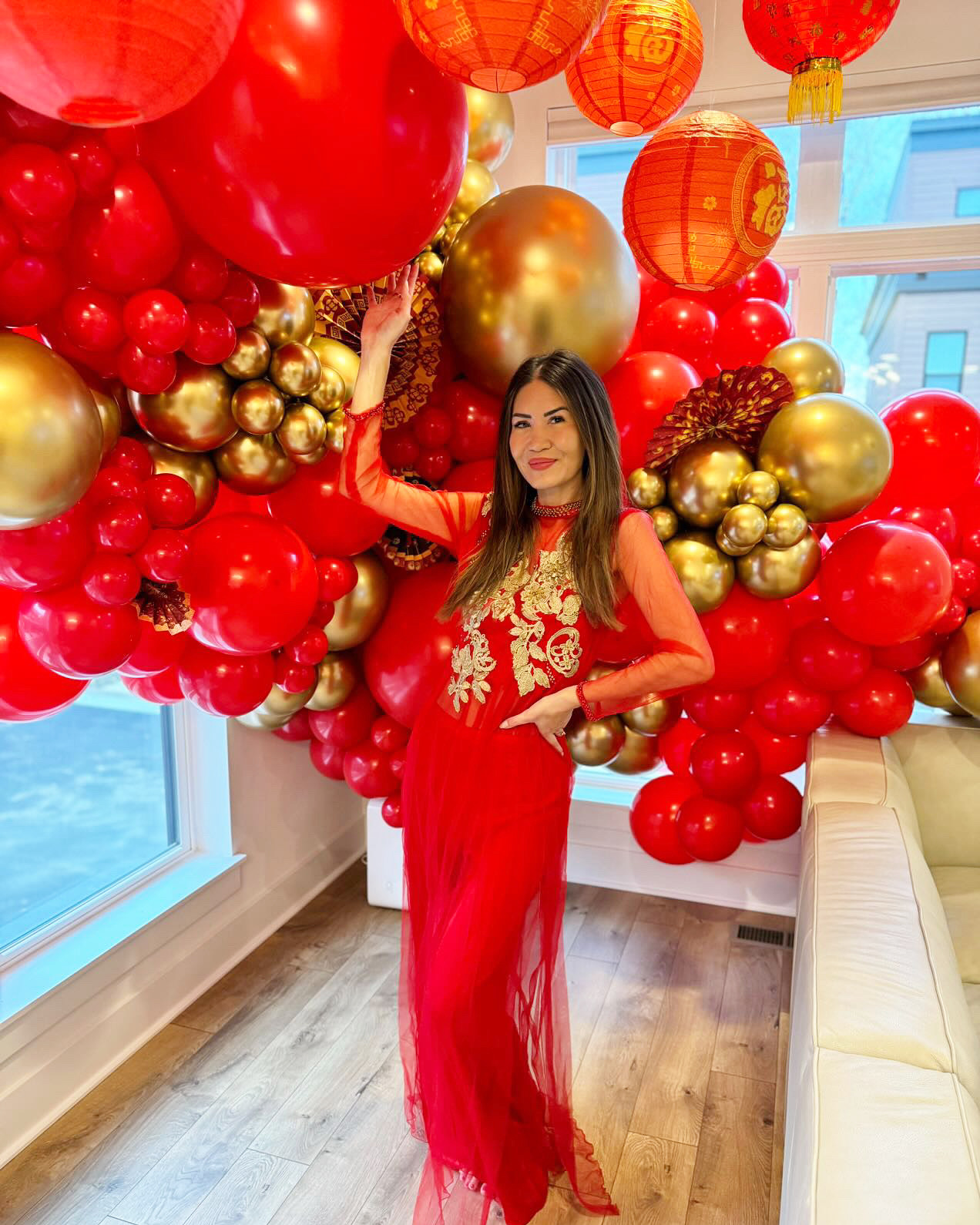
Red: Western: Passion, love, energy
Chinese: Good luck, happiness
African: Power, vitality
Blue: Western: Calmness, trust, stability
Hindu: Divinity, spirituality
Middle Eastern: Protection
Yellow: Western: Happiness, optimism
Asian: Royalty, prosperity
African: Fertility, abundance
Green: Western: Growth, harmony, nature
Islamic: Sacredness, paradise
Eastern: Prosperity, good fortune
Purple: Western: Royalty, luxury, creativity
Japanese: Wealth, power
Indigenous: Spirituality, connection
Orange: Western: Vitality, enthusiasm
Hindu: Purity, spirituality
Indigenous: Healing, transformation
Pink: Western: Romance, sweetness
Japanese: Transient beauty
Indigenous: Love, compassion
Black: Western: Sophistication, elegance
African: Spirituality, ancestors
Asian: Power, authority
White: Western: Purity, innocence
Eastern: Death, mourning
Indigenous: Peace, harmony
Gray: Western: Neutrality, balance
Japanese: Simplicity, subtlety
Indigenous: Wisdom, maturity
Even More Factors to Consider When Choosing a Color Palette
Selecting the perfect color palette for your event involves carefully considering several key factors. From the overarching theme and purpose of the occasion to the demographics of your attendees, each element plays a crucial role in determining the most suitable colors to evoke the desired atmosphere and emotions. Below, you’ll find a breakdown of these factors to guide you in crafting a color palette that sets the stage for an unforgettable event experience.
Theme and Purpose of the Event
The theme and purpose of the event should be the first factor that guides your palette. How do you want guests at your event to feel or react? For example, if a client requests a romantic atmosphere at their wedding, you might consider soft pastel shades to help create their vision. On the other hand, a corporate gala that celebrates innovation and progress might opt for bold, contemporary colors to convey a sense of excitement and futuristic focus.
Target Audience Demographics and Preferences
Understanding the demographics and preferences of the event attendees is crucial for choosing a color palette that resonates with them. For instance, an event targeting young professionals might incorporate more trendy colors, while a gathering of older adults might include a more classic palette.
- Venue Characteristics and Lighting Conditions
The characteristics of the event venue, such as its size, architecture, and existing decor, should inform the choice of color palette. Consider the lighting conditions in the venue, both natural and artificial, as they can significantly affect how colors appear. View the event color palette in the venue whenever possible to give you the most accurate information.
- Brand Identity and Messaging
When hosting a corporate event, colors associated with the brand logo or corporate identity can be incorporated to reinforce brand recognition and convey key messages. You should also think about the tone and objectives of the event when selecting colors that reflect the company’s values and goals, whether it’s fostering innovation, building trust, or promoting sustainability.
Exploring Different Common Palettes
Even keeping all of the factors above in mind, when you are choosing a palette of color for your event, you have a world of creative possibilities at your disposal. Whether you opt for the harmonious simplicity of a monochromatic palette, the cohesive elegance of an analogous scheme, the dynamic contrast of complementary colors, or the vibrant energy of a triadic combination, understanding these different approaches empowers you to create visually stunning and emotionally resonant experiences for your guests. Let’s explore each color scheme in detail to discover how to use them to elevate your event design to new heights of sophistication and style.
- Monochromatic: Using variations of a single color for a harmonious look.
A monochromatic palette uses different shades, tones, and tints of a single color to create a harmonious and sophisticated look. By playing with lightness and saturation, monochromatic palettes offer depth and visual interest while maintaining a sense of unity and simplicity.
- Analogous: Combining adjacent colors on the color wheel for a cohesive feel.
An analogous palette selects colors adjacent to each other on the color wheel. This creates a smooth transition between hues, resulting in a cohesive and pleasing aesthetic. Analogous palettes are versatile and can evoke different moods depending on the specific colors chosen.
- Complementary: Pairing colors opposite each other on the color wheel for contrast and balance.
Complementary colors are opposite on the color wheel, such as red and green or blue and orange. Using a palette with these contrasting hues creates a dynamic visual impact and a sense of balance. However, using complementary colors in moderation is essential to avoid overwhelming the space with too much contrast.
- Triadic: Selecting three colors evenly spaced on the color wheel for dynamic visual interest.
A triadic color palette involves selecting three colors evenly spaced on the color wheel, forming a triangle. This creates a vibrant and balanced palette with contrasting elements. Triadic schemes offer versatility and can be adjusted to suit different themes and preferences, making them popular for creating visually striking event designs.
Practical Tips for Choosing Your Perfect Palette
- Create mood boards and color palette research for inspiration.
Start by gathering inspiration from various sources such as magazines, websites, and social media platforms. Create different mood boards to visualize different color combinations and explore how they align with your event theme and objectives. This process will help you narrow down your options and refine your palette.
- Considering the seasonality and trends in event color schemes.
Take into account the season in which your event will take place and any relevant seasonal themes. It also helps to stay informed about current trends in event color palettes. While trends can provide valuable inspiration, be mindful of incorporating them in a way that still feels authentic and relevant to your event.
- Testing colors in different lighting conditions to ensure desired effects.
Colors can appear differently under various lighting conditions, so testing your chosen palette in the actual event space is essential. Consider natural and artificial lighting sources and how they interact with your colors. Make adjustments as needed to ensure that your palette achieves the desired ambiance and aesthetic in all lighting scenarios.
- Use color for accents or focal points to avoid overwhelming the space.
While color is a powerful tool for creating visual impact, it’s important to know how to use it in a way that doesn’t create sensory overload. Instead of saturating the entire space with color, consider using it selectively for accents or focal points to draw attention and create interest. This approach allows you to make a statement without overwhelming the overall design scheme and ensures that your chosen colors have maximum impact.
Color psychology is an important factor to consider when choosing a color palette for an event you are hosting. Color can evoke emotions, convey messages, and shape the overall experience for attendees. The thoughtful and strategic selection of color can help you create memorable and impactful events. You can transform an ordinary gathering into an extraordinary experience that resonates with guests on a deep emotional level. Creativity, intentionality, and a dash of color make the possibilities for creating unforgettable event experiences limitless.
Are you ready to elevate your event with stunning color palettes and design elements that captivate and inspire? Look no further! Lucy Blossoms specializes in luxury event design, custom backdrops, flower wall rentals, and balloon arrangements for every occasion – from corporate events and brand launches to weddings and private parties. Choosing the right colors is key to creating the perfect ambiance. Our expert team understands the psychology behind colors and can help you select the perfect palette to evoke the mood you desire. Whether you want to convey sophistication, romance, energy, or tranquility, we’ll guide you every step of the way. Explore our services today at your nearest Lucy Blossoms location, and let’s make your vision a reality!
